Loving the look of the site now that we've "graduated" out of beta!
In my professional life, I've become more engaged in designing for readability, and found that the WCAG contrast standards are a good minimum to hit—even irrespective of providing usability to users of all visual acuity levels (which itself seems like a decent goal, too).
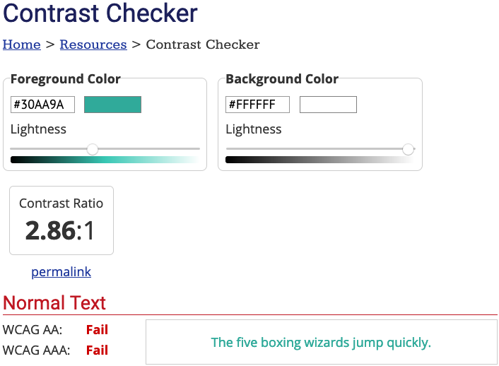
I noticed that hyperlinks on the main ELL site are sitting at a 2.86:1 contrast ratio between light green text and white background, dropping to an even less readable 2.03:1 when hovered over.
Are this concern and/or the associated desire shared by others? Is there a mechanism for updating the color?

