-5

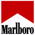
Is it just me or is the "flag" at the bottom of the English Language Learners logo very reminiscent of the Marlboro logo? If more users have this association, and given the health implications of smoking, would that be reason enough to adapt the design of the ELL logo?

I know that a logo redesign is such a big endeavour that the gut reaction to any request for change might be "nahh", but I would still like to at least bring it up.

18
  • 1
    It is just you. It is clearly a bookmark and a good design.
    – Chenmunka
    Commented Oct 6, 2016 at 8:31
  • 1
    How can you be sure? Mari-Lou A thinks it might be a medal ribbon.
    – Thomas
    Commented Oct 6, 2016 at 8:38
  • Besides, I never owned a bookmark that resembled the logo :-)
    – Thomas
    Commented Oct 6, 2016 at 8:39
  • 2
    I don't think it's so obvious that it's a bookmark. I'd actually forgotten that was what it was supposed to be until Chenmunka's comment reminded me.
    – user230
    Commented Oct 6, 2016 at 9:12
  • By the way: what's the semantics of downvoting? Does it mean "this is a bad question" or "I don't think the logos are very similar" or something else altogether?
    – Thomas
    Commented Oct 6, 2016 at 9:35
  • 2
    Hmmmm.... Interesting... This was never mentioned when the design was being discussed.
    – J.R. Mod
    Commented Oct 6, 2016 at 10:21
  • 1
    Votes on meta are disagreement/agreement and not bad/good: meta.ell.stackexchange.com/q/279
    – ColleenV Mod
    Commented Oct 6, 2016 at 10:27
  • @ColleenV Interesting, thanks! So you better don't ask controversial questions if you like your karma points.
    – Thomas
    Commented Oct 6, 2016 at 11:40
  • 4
    Oh, no - voting on meta has no effect on your reputation. You should propose anything. The idea is that we can get some idea how much agreement there is among the community on something.
    – ColleenV Mod
    Commented Oct 6, 2016 at 11:42
  • 2
    That's great to know! Had I known that before, I would have put more thought into phrasing the question so that agreement/disagreement votes would be more applicable.
    – Thomas
    Commented Oct 6, 2016 at 11:43
  • @J.R. The question you linked says: "I'd like to keep the bookmark shape as it is."
    – avpaderno
    Commented Oct 9, 2016 at 17:07
  • 1
    @kiamlaluno - The question that I linked to says a lot of different things.
    – J.R. Mod
    Commented Oct 9, 2016 at 22:10
  • @J.R. I was referring to your This was never mentioned when the design was being discussed. If that meant they never said what appears in the logo, it doesn't seem true, since they talk of the bookmark shape.
    – avpaderno
    Commented Oct 10, 2016 at 7:44
  • @kiamlaluno - All I meant was: before now, nobody seemed to notice any resemblance to a cigarette logo.
    – J.R. Mod
    Commented Oct 10, 2016 at 9:09
  • 2
    @Thomas - RE: I never owned a bookmark that resembled the logo... Neither have I, but try typing red bookmark into Google Images, and see what you get.
    – J.R. Mod
    Commented Oct 10, 2016 at 9:11

2 Answers 2

5

Here is the ELL logo just for discussion:
ELL Logo

I am an American and an ex-smoker who smoked Marlboro (although not the Reds), and I never made the connection. The color of the ribbon on the logo is orange, and Marlboro red is very much a primary color. There's also a shadow on one of the tips of the ribbon, and the proportions are different, so to me, they are dissimilar.

I am kind of annoying about visual things though. The fact that our links are unstyled on the main site still drives me crazy.

2
  • The problem with colors, of course, is misconfigured displays. To me, the shadow on the right tip of the ribbon/bookmark and the extended height are more distinguishing than the color.
    – Thomas
    Commented Oct 6, 2016 at 11:42
  • 2
    @Thomas There is also a significant part of the population that has varying degrees of color blindness, so the displayed color isn't reliable. In context though, there's nothing that evokes smoking to me.
    – ColleenV Mod
    Commented Oct 6, 2016 at 11:45
4

You mean ELL might be construed to be noxious for one's health? Absolutely never.

[enter image description here enter image description here

Although the red sky (?) does look like ELL's medal ribbon, or is it supposed to be a bookmark?

10
  • To me, the problem is not what somebody may think about ELL, but that the site is (implicitly and unintentionally) endorsing a cigarette manufacturer.
    – Thomas
    Commented Oct 6, 2016 at 8:20
  • @Thomas Subliminal Advertising, you mean? I doubt it. See also this definition: businessdictionary.com/definition/subliminal-advertising.html
    – Mari-Lou A
    Commented Oct 6, 2016 at 8:23
  • The only problem I could possibly envisage were if ELL became a world leader, or a brand, among English Q&A websites, then lawyers might go poking around trademarks, logos etc. I seriously doubt this will ever happen in our lifetime. No offense to Stack Exchange intended.
    – Mari-Lou A
    Commented Oct 6, 2016 at 8:27
  • Sorry, I don't think I made my point very clear because none of the things you bring up are what I had in mind. Subliminal Advertising seems to presuppose an intention on the side of the advertiser, but I'm more worried about that SE may unintentionally and unknowingly play into the hands of a doubtful cause. Similarly, I'm not worried about liability or copyright infringement. My point is perhaps more on the ethical side: if the logo evokes association with said cigarette manufacturer in a fair amount of people, should that be reason to change it?
    – Thomas
    Commented Oct 6, 2016 at 8:35
  • 2
    @Thomas I don't think it's a problem, but I'm not an American, and maybe this might possibly be an issue. I think the association between ELL and Malboro's logos might be visible only to those ELL users who smoke the actual brand, or, to graphic designers.
    – Mari-Lou A
    Commented Oct 6, 2016 at 8:39
  • Well, I am neither :-) But I'm very happy to accept if most people don't see a problem with the logo. That's actually what I expected.
    – Thomas
    Commented Oct 6, 2016 at 8:39
  • 3
    The resemblance would never have occurred to me. For what it's worth, I'm an American, but I don't smoke and I'm not a graphic designer.
    – user230
    Commented Oct 6, 2016 at 9:18
  • 2
    There have been times when I've thought that the ELL logo looked too much like a chimney from a Lincoln Logs set. But that's just me.
    – J.R. Mod
    Commented Oct 6, 2016 at 18:52
  • 3
    I smoked Marlboros for forty years and the similarity never occurred to me. Commented Oct 7, 2016 at 15:20
  • Although I‘ve recently switched to generic brands (whichever one is on sale), I started 44 years ago as a freshman in college with the 5-cig mini-pack of Marlboros that was included in my (and all my fellow freshmen’s) “Freshman Orientation Goody Bag.” …. I can honestly say that I’ve never given a single waking thought to how Marlboro’s logo might or might not resemble a bookmark but there might be some relevance at a subconscious level in the fact that I discovered quite early on that once empty, flattened Marlboro packs do make great bookmarks. cc: @StoneyB
    – Papa Poule
    Commented Oct 7, 2016 at 22:50

You must log in to answer this question.

Not the answer you're looking for? Browse other questions tagged .