UPDATE 22 Feb. 2016
Looking at your comments, it seems like we need to tweak a few things:
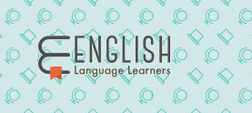
- Capitalize the word "Learners"
- The bookmark should start "inside" the books and not below
- A colored bookmark will be better
I chose red for the bookmark as it's widely used for those and it goes well with the color scheme.
UPDATE 15 Feb. 2016
First, thank you for your feedback. I really appreciate your involvement and hope we'll build something together that will work for this community.
A few people had concerns about the logo:
- "Language" should be fully spelled out
- The bookmark is a too big
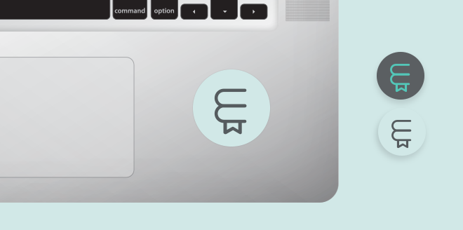
Here is an updated version, I had to change the typography to be able to write "Language learners" without breaking the balance of the logo.
I believe this one works pretty well, better than the previous one. I'd like to keep the bookmark shape as it is: it's easily recognisable and balances the overall shape.
I'm Stéphane, a senior product designer at Stack Exchange. First, I wanted to announce that this site is now starting the process of moving out of beta to become a fully-graduated site!
Congratulations!
Graduation and Your Site Design
Graduation comes with a few perks. I have already begun work on your site's design, which will give you your own unique theme that reflects your topic and culture. This will help brand your site as unique, even while you share common elements with other sites that show you are part of a bigger Stack Exchange family.
Once the design goes up, you will receive a link in the footer of other sites in the network, along with the ability to migrate content to and from other sites — and the acclaim of a public launch that says,
Congratulations, you finally made it!
Design Concept
As it has been brought in this meta post by the community, the visual identity should convey meaning and learning.
To me, when it comes to "meaning" and "learning", all comes down to the dictionary. That's one thing you have to read at some point (or refer to) when you learn a foreign language (and that's what I'm always doing since I'm not a native speaker :) ). There's simply no other way, that's the one thing everyone who's learning a new language has in common.
As a result, I wanted the visual design to:
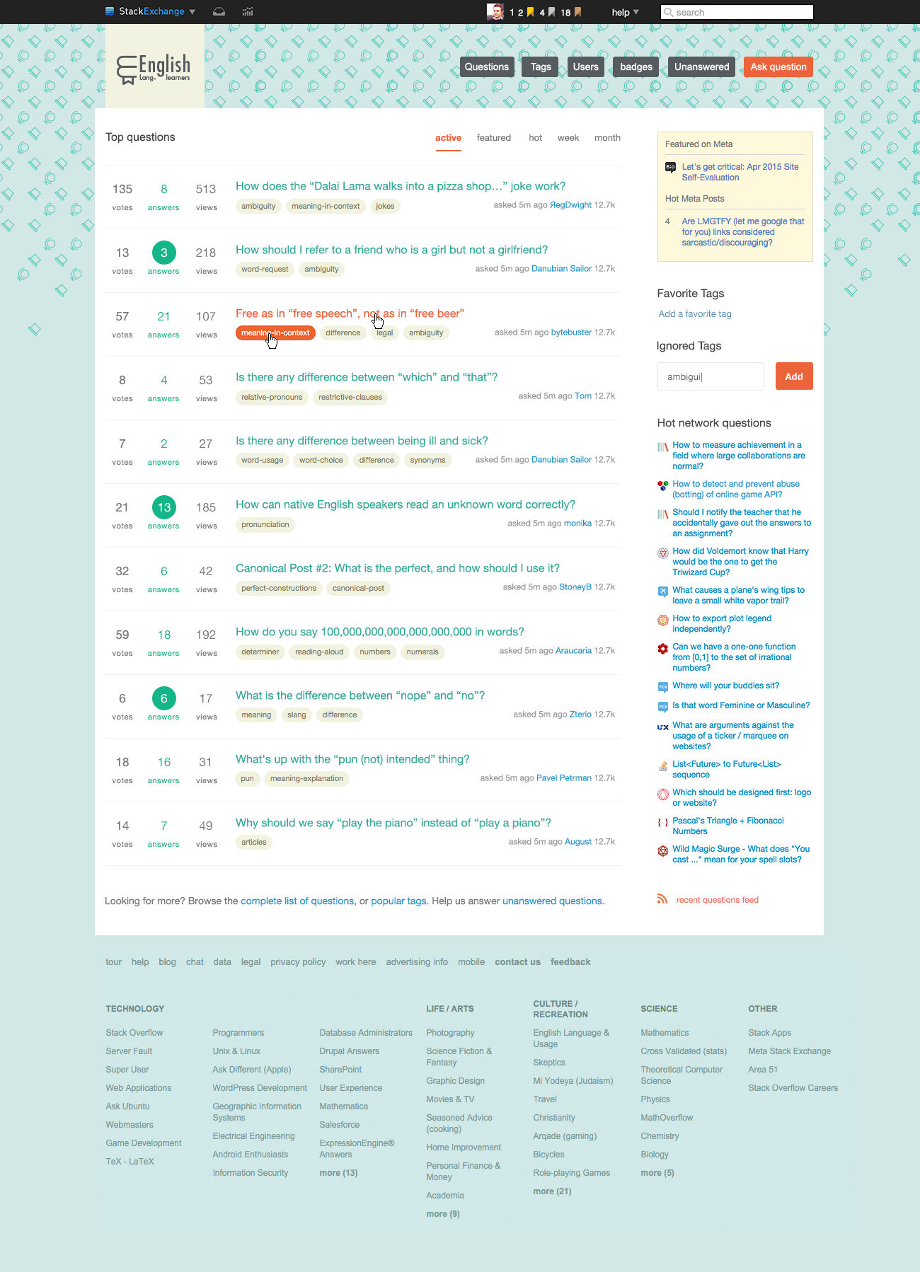
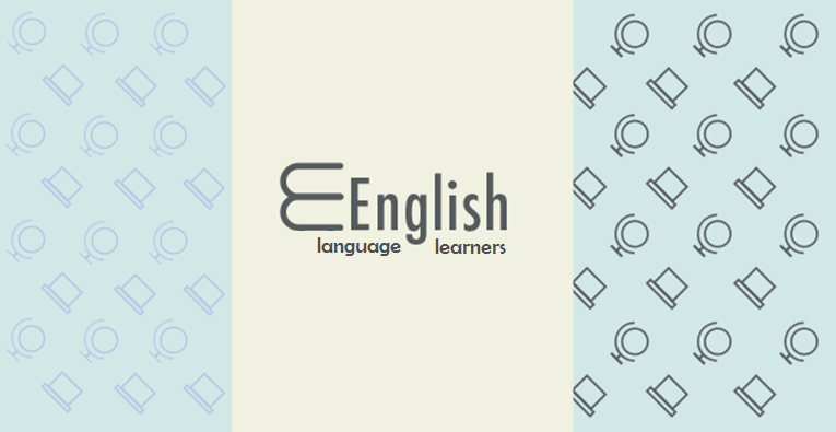
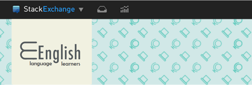
- use a dictionary shape for the logo as long as it's not too simple/obvious
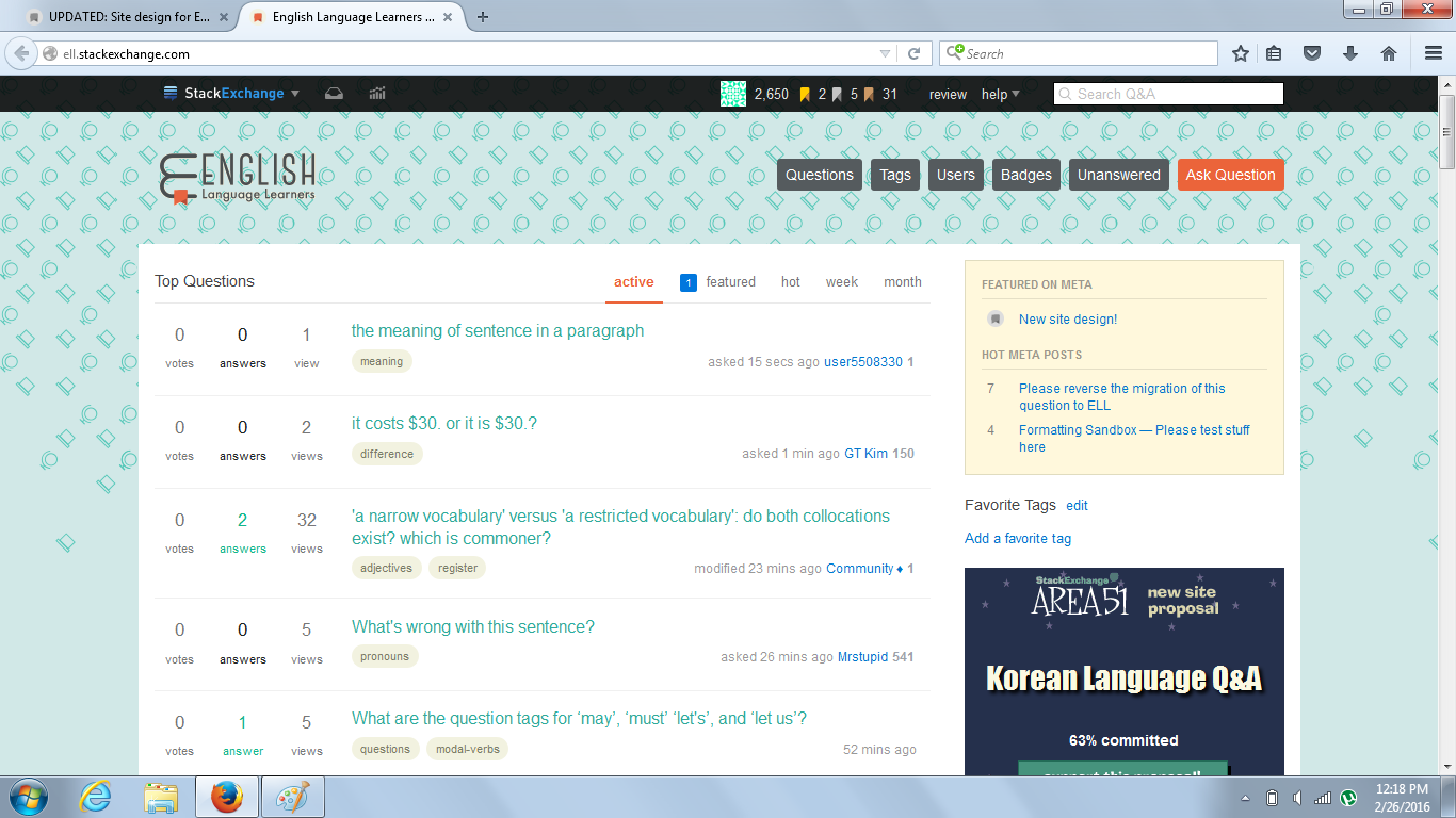
- use a repetitive pattern to reproduce how repetitive books look like when they're stored in a library (a globe and a chalkboard here)
- use light colors (like a book's paper)
Logo, Identity and home page
User interface elements
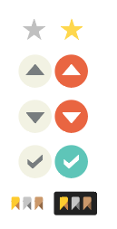
Favorite, vote arrows, accepted answer and badges
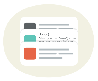
Page captcha
Concept: definition/meaning of "bot"
Page not found (error 404)
Concept: missing dictionary on a bookshelf
Error page (error 500)
Concept: No meaning / nonsense
We believe the design and branding will work very well for this community, it’s unique and capture the right mood. We’d love to hear your feedback, and if there are no major design changes, we’ll launch the new site design and graduate the site from Beta soon.
Thank you for for making this such a great community!

